Major Bank
Building a safe and discreet way to make online payments
while keeping your financial & banking credentials safe.
Mobile app · Personas. · Wireframes. · User Journeys · Site Map · Design Language. · Usability Testing. · Information Architecture · Lessons Leaned


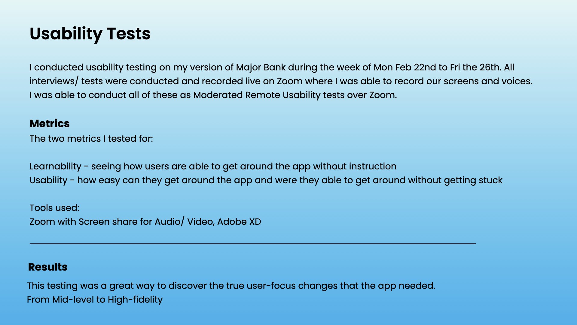
Who I’m testing:
Meet Micah and Michelle - here to help me get the big picture of the needs and goals of the potential users.

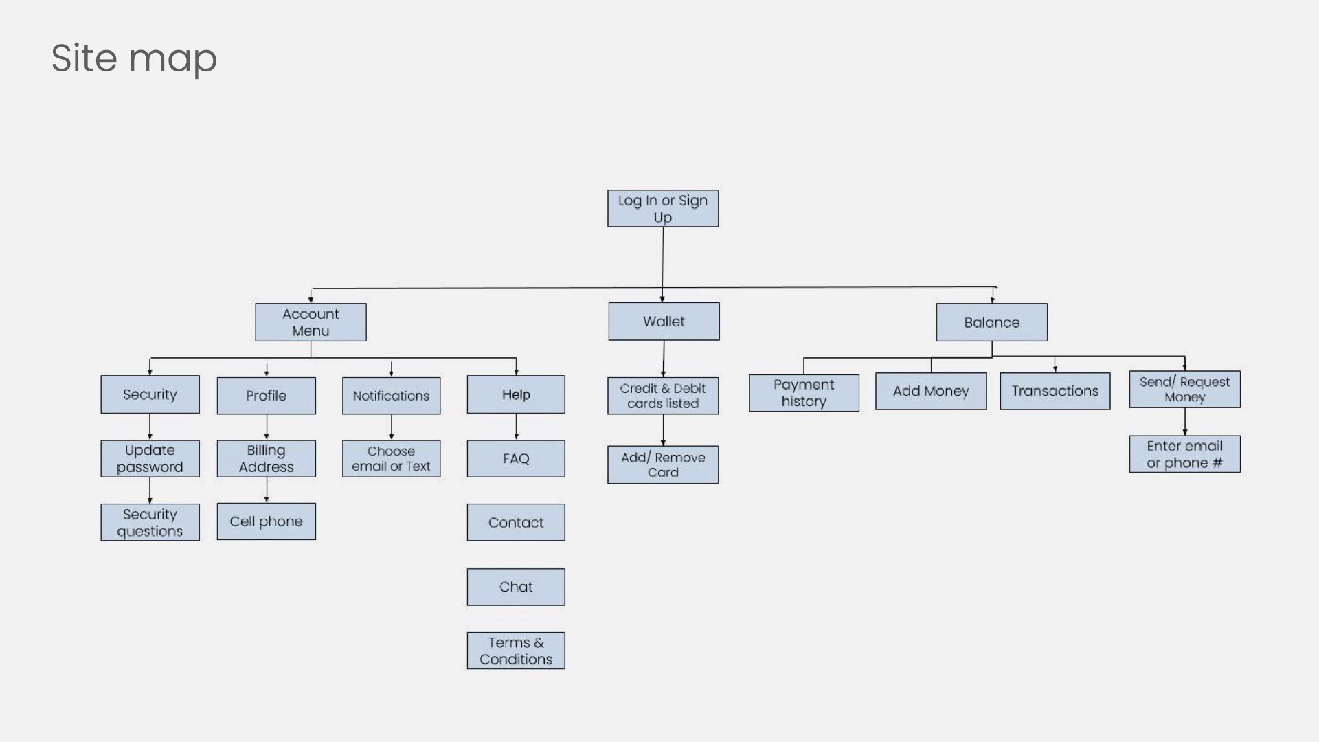
User Flow & Task Analysis
These Task analysis and User Flows were put together to map out how the user would go about completing their tasks desired.


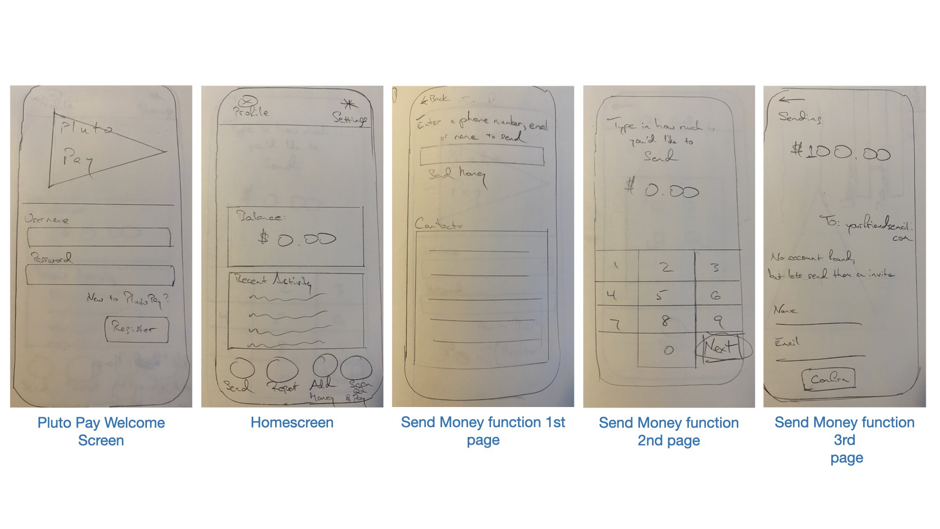
Low Fidelity wireframing
To fit the needs of my future users, my early wireframes featured just the main function screens.
1) For a cautious, financial online user like ‘Micah’, I wanted screens to get started without asking for too much information up front.
And…
2) for a newer user like Michelle who needs a quick app for accepting payments for her Air B’nB business, having as few steps as possible for in-the-moment transactions would also be needed.
For instance, the 5th wireframe on the right is one of the main features she’d use: the ‘Sending Money’ screen.
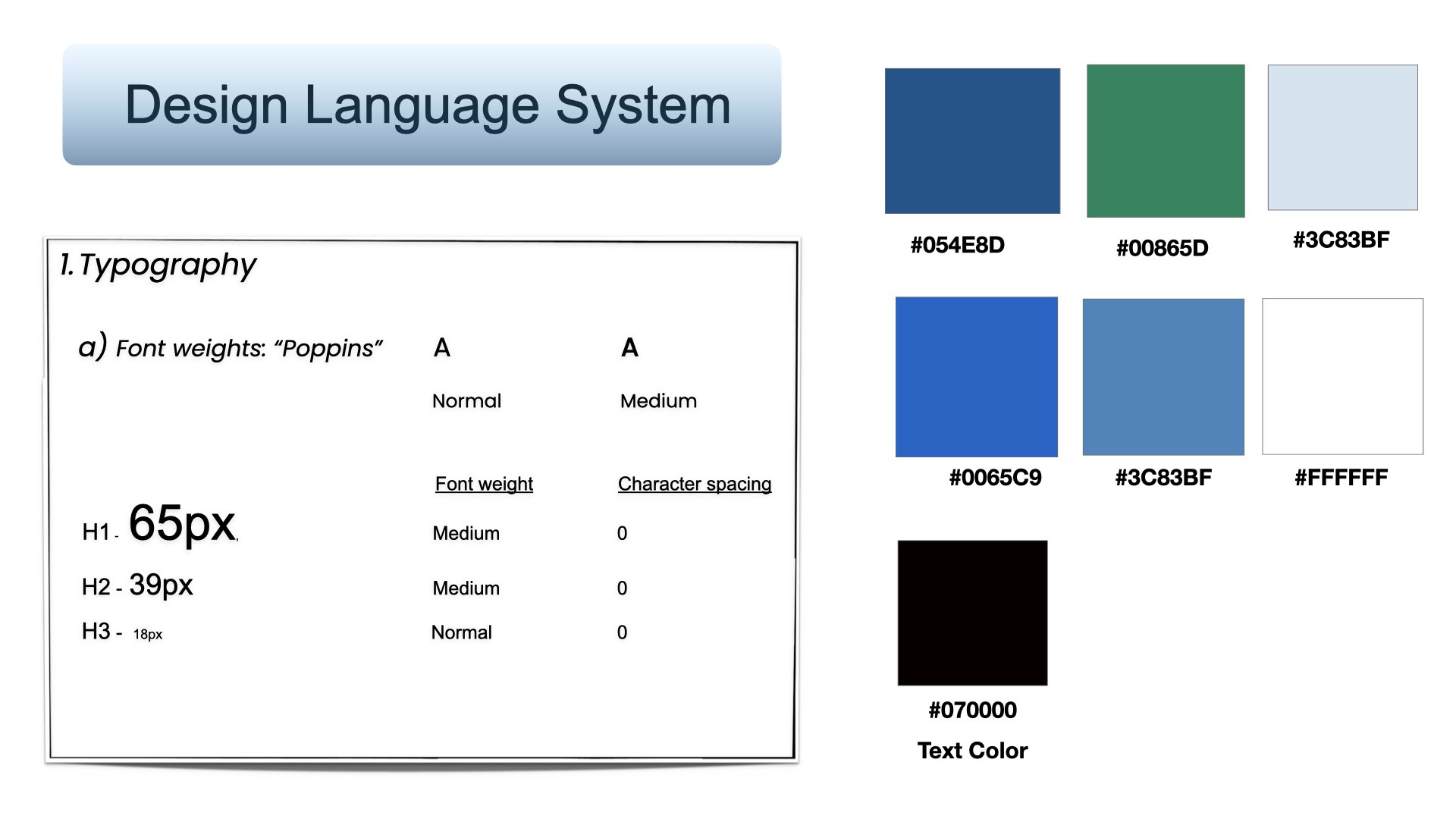
After getting together the basic look of the screens in the wireframes above, I picked out the general colors and typography that I wanted to use.
I specifically went with a lot of blue for this app since its often used as a color to give a feeling of confidence in money apps.
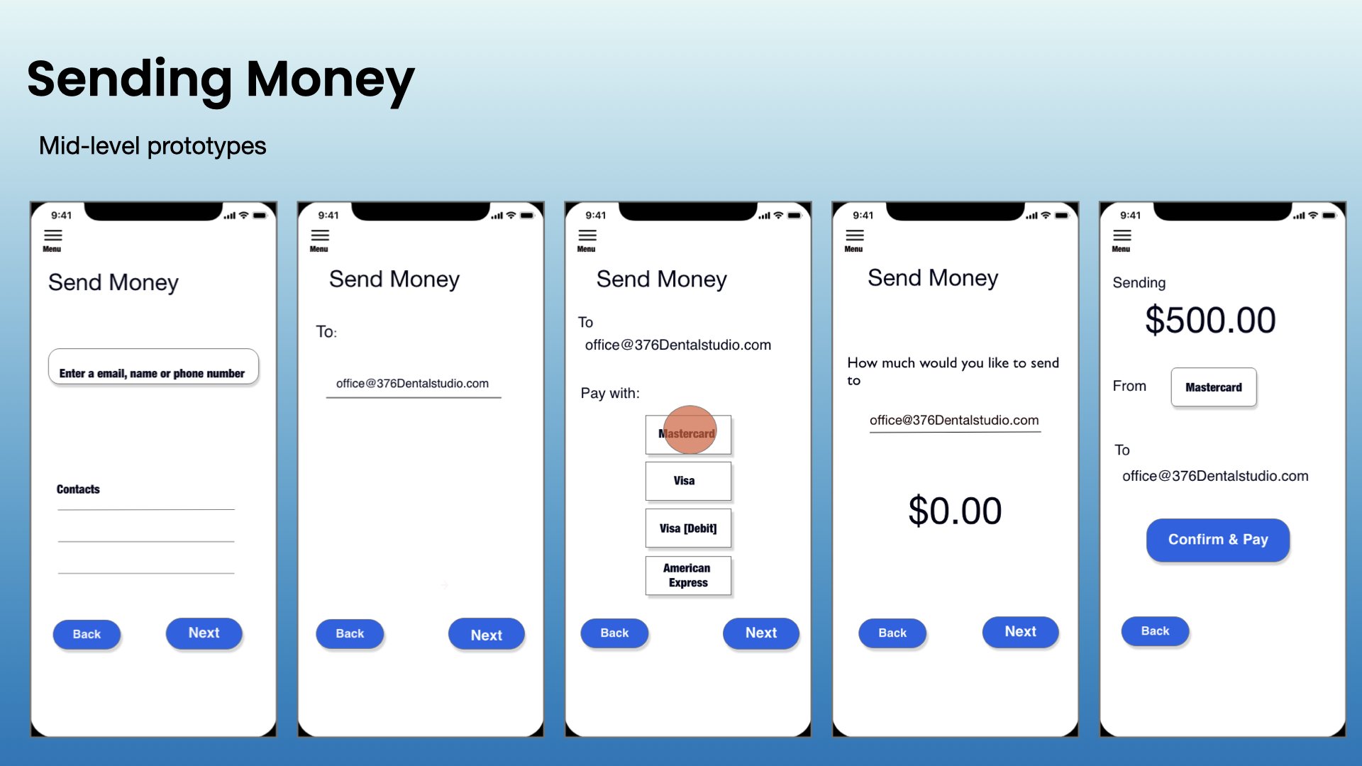
Mid-level wireframes.
When I started getting a better idea of how I wanted the screens to look, I began construction of the actual designs.
High Fidelity Wireframes
In this higher fidelity version, I was able to make some changes to some of the copy, making it a bit more specific in its questions.
And also, based on user feedback, I not only made changes to the button layout (moving the “back” button to the top), but I changed the name of the function from
‘Send’ to just ‘Pay’. Since I wanted to make ample use of white space that I could, I was able to keep that aspect from the earlier iteration, while making it more polished.

Lessons learned
While Major Bank has grown and developed by way of the research from my UX Design immersion course at Career Foundry, the final outcome didn’t exactly reinvent the wheel with this particular project. Future improvements will definitely continue with more iterations to come.
New iterations focusing on:
Refining graphic details of each screen
Improving backgrounds & icons
increasing task efficiency
Test animations if they fit with this type of app